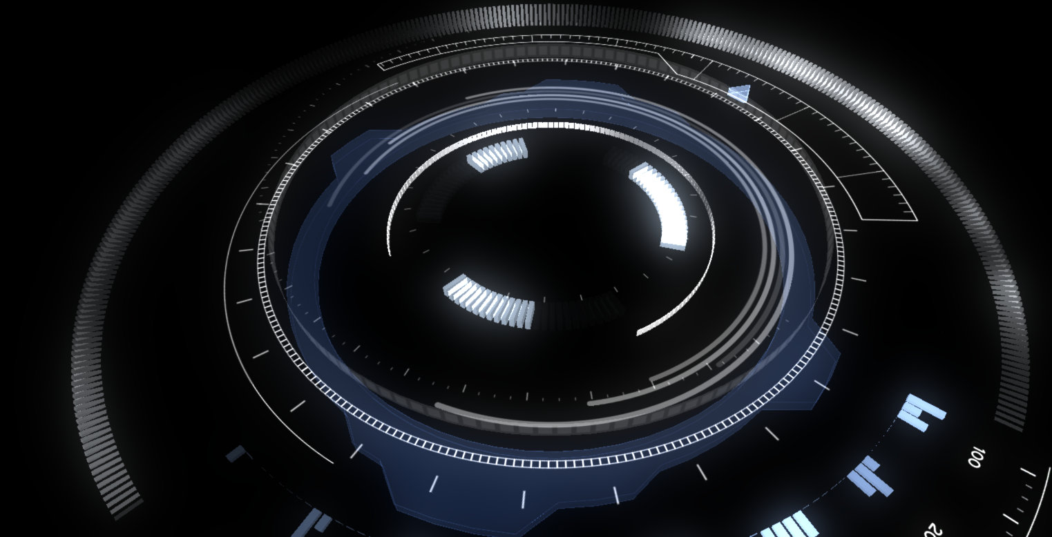
I've got a bunch of new work to show for my Iron Man inspired music visualization HUD. 95% of the elements are place. Here's a breakdown of what's new including a video showing everything in action.
Frequency meters now change in brightness based on their channel's amplitude. Its much easier to see this animated, but here is a quick image showing what I mean.
Notice how the bands in the 300 range are brighter than the bands in the 100 or 600 range. This is a nice indication of that the amplitude is greater for that particular frequency range. You'll notice not all the bands are animating. Right now I have each channel visualizing a different frequency range. In a live setting with various microphones, the effect will look more like this.
This would be 8 frequency ranges per channel.
In the center, I've got a few standard equalizer bars. Each one representing a different frequency range or microphone.
The outer ring that consists of many small slivers is a really cool part to all of this. I wanted to take the traditional equalizer bar graphs that are typically associated with music visualizations and combine them with particle trails which are another common staple. The beauty of particles and particle trails is that they show history. As the particle ages, it fades away, changes color, flies off in some direction based on turbulence fields or some other particle system effector. This outer ring combines both of these elements into one.
In this image, the light starts on the far left and moves in an arc to the right. It's currently tied to highest frequency range so only high pitched singing or cymbal hits will affect it. As the left side reacts to the music, each subsequent segment responds to the segment preceding it. This sets up a really cool chain reaction where you can watch the history of high-pitched cymbal hits. It takes about 6 seconds before this history vanishes. All of this is procedurally generated so you can control which objects get copied, how many, their overall position in the space, scale variation, color.....well the list goes on. Here is close up of that arc band.
All of these different elements are actually constructed/scripted in such a way that they can be easily modified or made to look different from their original intentions. I try to build in this flexibility so I can repurpose some parts in other visualizations or reuse them in this visualizatio.
To conclude all this, I've got a short video here. Not sure why I'm on a jazz kick lately but the visuals are reacting to another composition I've started working on today. Enjoy!
We're getting into the home stretch now. I need to balance all of these elements a bit better, separate them some more on the Y-axis and get a background in place. Also there is one big unifying piece that needs to be put into place. Looking to wrap this up in the next week. Stay tuned...


No comments:
Post a Comment